
Capture The Flag Signs
To do some promotion for this brand some old shelves of clothing closets were pulled out the shed. They were ones painted smoothly but now had some cracks and dents in it. Also the base paint is aged by use which actually gives the best outlook.
By keeping this one simplified the worn out shelve, which is made out of together clamped wooden shelves, gets the attention it deserves. So a kind of stencil type is created to give it a modern army outlook. Because the base layer is white, the decision to put a color of the other shirt as type color was easily made. To give it a little bit more depth black line is added as kind of shadow, so it won't lose the stencil outlook.
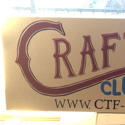
For the second sign a few old sign on the side of cars gave the inspiration paint about the reselling product and not about the name of the brand itself. Also the website is already on it so has less of a communicating the brand name again. The red with high and low lights in contrast with the less outspoken blue works to get a more three dimensional feel.
To progress on giving a three dimensional feel to the words inspiration is found in the art work of Doug Aitken. Which finally worked out great in sign painting. While working the inspiration to let the word 'The' be the cutout of a form came. The word 'Flag' is keepen a little bit sober to don't take away the attention of those techniques.
 |
|---|
 |  |  |
|---|---|---|
 |  |  |
 |
 |  |  |
|---|---|---|
 |  |  |
 |